Menu creation
How to create a restaurant menu: a practical step-by-step guide
Plan, write, design, test, and publish a restaurant menu that works beautifully in print and on every guest’s phone.
aiMenuu Editorial Team · July 27, 2026 · 10 min read
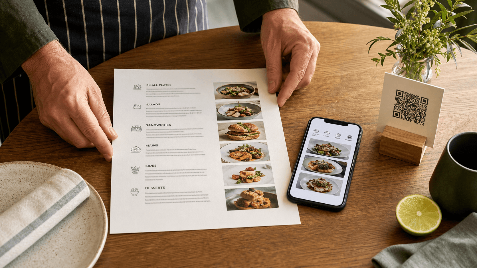
A strong restaurant menu is a decision-making tool, a brand expression, and an operational source of truth. The best menus help guests understand the food quickly while giving the restaurant enough flexibility to update prices, availability, and seasonal dishes without rebuilding everything from scratch.
Start with the job your menu needs to do
Before choosing fonts or taking food photos, define the menu’s job. A neighborhood lunch counter may need speed, obvious combinations, and easy-to-find prices. A bakery may need visual browsing and clear daily categories. A full-service restaurant may need to explain unfamiliar ingredients while keeping the page calm. Write down the primary dining occasion, the typical guest, and the questions that person asks before ordering. This short brief becomes a filter for every later decision. If an element does not help the guest understand the offer, trust the restaurant, or choose a dish, it probably does not belong on the menu.
Treat print and mobile as two views of the same information rather than separate projects. Your dish names, descriptions, prices, dietary notes, and category order should come from one organized menu structure. Print can create atmosphere at the table, while a mobile menu can make long categories easier to navigate and information easier to update. Starting with shared content prevents the embarrassing situation in which a printed price, website price, and QR menu price all disagree. It also makes future redesigns much easier because the content is already clean and reusable.
Build a clear menu structure
List every item in a simple working document or menu builder, then group items according to how guests actually browse. Familiar category labels such as Breakfast, Tacos, Small Plates, Mains, Desserts, and Drinks usually work better than clever names that require explanation. Keep categories distinct and avoid placing the same dish in several sections unless there is a genuine guest need. Within each category, order items intentionally: begin with an approachable signature choice, place related dishes together, and finish with options that naturally complete the section. A logical sequence reduces scanning effort and makes a long menu feel shorter.
The right number of items depends on the concept, but every item should earn its space. Look for duplicate dishes that differ only slightly, items that rarely sell, and choices that complicate the menu without strengthening the restaurant’s identity. A focused menu is easier to read and gives important dishes more visual room. It is also easier to maintain across formats. This does not mean every restaurant needs a tiny menu. It means guests should understand the range quickly and recognize why each category exists. When a section grows large, use meaningful subcategories rather than shrinking the type or packing lines together.
Write dish names and descriptions for real people
A dish name should be recognizable, specific, and consistent with the restaurant’s voice. Straightforward names often outperform elaborate ones because guests can scan them quickly. Use the description to answer the next most useful questions: What are the defining ingredients? How is it prepared? What makes it different from the similar option above it? Lead with concrete information, not empty adjectives. “Corn tortilla, achiote chicken, charred pineapple, onion, and cilantro” helps a guest decide. “An unforgettable explosion of delicious flavor” does not. Specific language is also easier for search engines and answer systems to interpret because it describes actual food entities and preparation methods.
Keep descriptions parallel. If one taco description lists fillings, the other taco descriptions should generally do the same. Decide how you will format allergens, dietary markers, spice levels, sizes, and add-ons, then apply the rule everywhere. Avoid making medical guarantees unless the restaurant has procedures that support them. “Prepared without gluten-containing ingredients” and “gluten-free kitchen” are not interchangeable claims. When a term may be unfamiliar, add a brief plain-language explanation instead of assuming every guest knows it. Clarity feels hospitable, and hospitality is the purpose of good menu writing.
Present prices clearly and consistently
Guests should never have to hunt for a price or guess what it includes. Choose one price format and use it consistently: for example, 14, $14, or $14.00. Align prices in a predictable location, but do not let a long wall of dots overpower the dish names. If an item has multiple sizes, label each size clearly. If supplements or add-ons change the total, place them close to the relevant item. Clear pricing is both a usability requirement and a trust signal. A beautifully designed menu will still feel careless when prices drift, wrap awkwardly, or appear to belong to the wrong dish.
Review prices in context, not only in a spreadsheet. On the final menu, confirm that every price remains attached to its dish at narrow mobile widths and on the printed page. Long names and translated descriptions can expose layout problems that short placeholder copy never reveals. Test the highest price, the longest item name, and the longest description in every template you consider. Designing for realistic edge cases prevents clipped text and crowded right borders later. It also helps you choose a layout based on your actual content rather than an attractive sample menu.
Choose a visual hierarchy before decoration
A dependable menu hierarchy has a small number of levels: restaurant identity, menu title, category heading, dish name, description, price, and supporting notes. Each level should look distinct without using a different typeface or color for everything. Begin in grayscale. Make the hierarchy work through size, weight, spacing, and alignment, then add the restaurant’s colors and graphic details. This approach keeps the design readable and prevents decoration from doing structural work. Guests should be able to locate a category and scan its dishes even if they ignore every photograph and illustration.
Use typefaces that stay legible at the final size. A distinctive display face can give headings personality, while a simpler text face usually performs better for descriptions and prices. Avoid very thin weights, tight line spacing, and low-contrast gray text on colored backgrounds. Printed menus face dim lighting, glare, stains, and varied viewing distances. Mobile menus face small screens, outdoor brightness, and browser text scaling. A design that survives those conditions will also look confident under ideal conditions. White space is not wasted space; it separates decisions and makes the entire menu feel more deliberate.
Use food photography with a purpose
Food photos can help when guests need to understand an unfamiliar dish, when visual choice is central to the concept, or when a signature item deserves emphasis. They are not automatically necessary for every menu. If you include images, use a consistent lighting style, crop, color treatment, and level of detail. Different photos should represent different dishes; repeating one image across several items reduces trust. Select photographs that show the portion honestly and remain recognizable at the size where they will appear. On mobile, optimize files so the menu loads quickly instead of forcing guests to wait at the table.
Give every meaningful web image descriptive alternative text that explains what is visible without stuffing keywords. Decorative textures can use empty alternative text. A useful filename such as roasted-cauliflower-tacos.jpg is better for maintenance than IMG_4821.jpg, but the surrounding article and menu content matter more than the filename alone. Never place essential dish information only inside an image. Names, descriptions, prices, and dietary notes should remain real HTML text so guests can enlarge it, assistive technology can read it, and search or answer engines can understand it.
Design the mobile menu as its own experience
A mobile menu is not a miniature poster. Use a single readable column, comfortable spacing, and category controls that let guests move through a long menu without endless scrolling. Tap targets should be large enough for a thumb. Keep the restaurant name and essential context visible without consuming most of the screen. Dish names and prices should appear together, and descriptions should wrap naturally without being clipped at the right edge. Test at common phone widths and increase browser text size to make sure the layout remains usable. The goal is not merely to fit the content; it is to make choosing feel effortless.
Speed matters. Compress images, avoid autoplay media, and deliver the important menu content directly in the initial page rather than hiding it behind a loading effect. Guests may scan from a weak cellular connection, so a lightweight page is part of hospitality. It is also helpful for search visibility because meaningful server-rendered text can be discovered without waiting for client-side scripts. A mobile-first menu builder can handle the responsive foundation, but the restaurant still needs to preview every category and check the real content before publishing.
Connect print and mobile with a reliable QR code
A restaurant QR code should open the live mobile menu directly, not a marketing page that asks the guest to click again. Use a permanent destination you control so the menu can change without replacing every printed code. Place the code on a table card, counter sign, window, or printed menu with enough blank space around it. Add a short instruction such as “Scan to view the live menu,” because a code without context makes guests hesitate. Keep the printed URL nearby as a fallback for accessibility and for guests whose camera settings do not recognize QR codes.
Test the final printed piece, not only the QR file on your computer. Scan it with both iPhone and Android devices at the distance and lighting where guests will use it. Check that the destination uses HTTPS, loads quickly, and shows the intended restaurant menu. Avoid stretching, recoloring, or placing artwork over the code unless you can test the result thoroughly. Contrast and quiet space are more valuable than novelty. Re-test after changing domains or publishing settings, and keep one table card at the office as a reference sample for future checks.
Proof the menu like a guest
Proofreading should happen in several passes. First check facts: item names, ingredients, prices, sizes, dietary notes, and business details. Next check consistency: capitalization, punctuation, number formats, category labels, and terminology. Then check the experience: Can someone find a vegetarian option? Can they compare two similar dishes? Is the drinks section obvious? Finally, inspect the rendered design for clipping, awkward wraps, tiny type, low contrast, repeated photos, and empty space that looks accidental. Ask someone who did not build the menu to complete a few realistic tasks while you watch.
Print one physical proof at actual size. A4 proportions, margins, color, and type can feel very different on paper than on a large monitor. Open the mobile version on a real phone and scroll every category. Try landscape orientation, text enlargement, and a slower connection if possible. Click every interactive category button and scan the QR code from the proof. These checks are inexpensive compared with reprinting a full run or confusing guests during service. Record the approval date and the person who checked prices so the team knows which version is current.
Publish, maintain, and improve
Publishing is the beginning of the menu’s working life. Establish a simple update routine: one owner for menu content, a consistent way to record changes, and a final review before those changes go live. Update availability promptly, review seasonal categories on a calendar, and audit prices across print and mobile before each reprint. Keep the public URL stable and use a canonical page address. For the website version, provide a unique title, description, clear heading, crawlable links, and structured data only when the restaurant has accurate information to support it. Do not invent ratings, hours, or other facts for search visibility.
Measure quality with guest behavior and staff feedback rather than chasing decoration. Note the questions servers answer repeatedly, the categories guests overlook, and the descriptions that cause confusion. Those signals reveal where the menu needs clearer language or structure. A flexible system such as aiMenuu can keep the content connected while you test a different template, publish a mobile-friendly menu, and prepare a coordinated print version. Explore the restaurant menu templates for a suitable visual starting point, then use the QR menu workflow to give guests a direct path to the current menu. The strongest menu is not the one that never changes; it is the one that can improve without losing consistency.