Menu design
What size should a restaurant menu be? Print and mobile guide
Choose a practical restaurant menu size for print, folds, table use, and mobile screens without sacrificing readability or easy updates.
aiMenuu Editorial Team · August 6, 2026 · 10 min read

A restaurant menu should be large enough to present the full selection at a comfortable reading size, but small enough to handle easily at the table, counter, or takeaway point. For many independent restaurants, US Letter (8.5 by 11 inches) or A4 (210 by 297 millimetres) is a useful starting sheet size, not a universal answer. The right final size depends on item count, viewing distance, table space, folds, printer requirements, and how often the menu changes. A mobile menu should use the same approved content in a responsive layout rather than reproducing a paper page on a phone.
What is the best size for a restaurant menu?
There is no single best restaurant menu size. A focused cafe menu may work well on a half-sheet or narrow card, while a full-service restaurant with several sections may need a letter-size or A4 sheet, a fold, or more than one page. Start with the amount of approved content and the way guests will use it. Then choose the smallest format that keeps names, descriptions, prices, and important notes comfortably readable without crowding.
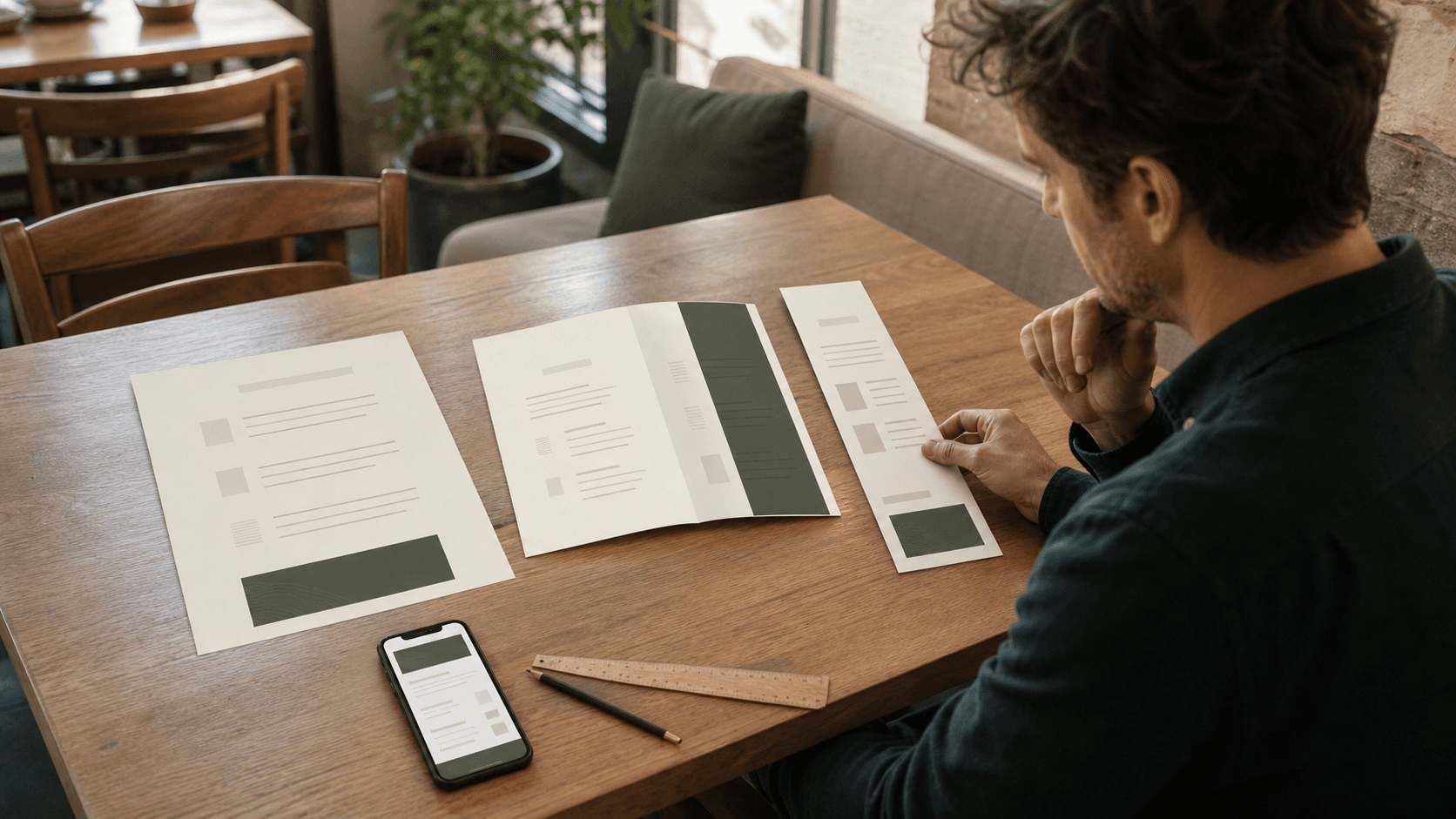
As a practical starting point, compare one familiar local paper size with a smaller and a larger alternative. In the United States and Canada, that may mean Half Letter, US Letter, and Legal or Tabloid formats. In countries that use ISO paper sizes, compare A5, A4, and A3. These are convenient production references because printers understand them; they are not rules about how a restaurant menu must look.
Choose the format around the dining experience
Think about where the guest holds or reads the menu. A large sheet may be comfortable at a spacious dining table but awkward at a narrow counter or crowded two-top. A small card can suit a short drinks or dessert list, yet it becomes frustrating when dense text forces the guest to bring it close. Takeaway menus may need to fit a display holder or envelope. Wall and counter boards are read from farther away and require a different information hierarchy from hand-held menus.
Also consider how staff distribute, clean, collect, store, and replace the menu. A dramatic oversized sheet may photograph well but slow table resets or collide with glassware. A long multi-panel fold may hold everything but make one category hard to find. The right format supports the service routine as well as the visual identity. Browse restaurant menu templates only after writing down these physical constraints, so the chosen design solves a real use case rather than creating a new handling problem.
Match one format to one job
The main food menu does not have to carry every temporary message. A compact insert can hold a seasonal list, and a separate card may suit desserts or drinks when staff present them later. Splitting content is useful when it follows the guest journey; splitting it only to rescue an overfilled layout creates extra searching. Decide which information belongs in the primary decision and which genuinely deserves its own moment.
Use common paper sizes as production references
Common North American sheet sizes include Half Letter at 5.5 by 8.5 inches, US Letter at 8.5 by 11 inches, Legal at 8.5 by 14 inches, and Tabloid at 11 by 17 inches. Common ISO sizes include A5 at 148 by 210 millimetres, A4 at 210 by 297 millimetres, and A3 at 297 by 420 millimetres. Orientation can be portrait or landscape, and any of these sheets may be used flat or folded if the printer and paper stock support the plan.
A familiar size can simplify printing, proofing, sleeves, and replacement, but custom dimensions can be appropriate when a restaurant has a clear reason. Before committing to a custom trim, ask the printer about available sheet stock, cutting, minimum quantities, finishing, and waste. A small difference in dimensions can change which production sheet is needed and therefore change cost or turnaround. Request a written specification instead of adapting the final artwork from memory.
Do not confuse paper size with readable space
The named sheet dimension is not the amount of room available for menu copy. Margins, folds, binding, image crops, decorative areas, and the printer's safe zone all reduce usable space. A letter-size sheet with generous margins may provide less copy area than a carefully planned smaller format. Judge the layout by its usable columns and panels, not by the outside measurement alone.
Understand flat size, finished size, and folds
Flat size is the full dimension of the printed piece before folding. Finished size is what the guest holds when it is closed. A sheet folded once in the centre creates four faces: front cover, two inside panels, and back cover. A three-panel fold creates six faces, but the panels may not all be identical because one panel often tucks inside. Describe both dimensions and the fold direction when requesting a quote or preparing artwork.
Plan folds with a physical dummy. Fold blank paper to the intended finished size, label every panel, and page through it as a guest would. Confirm which panel becomes the cover, where the main categories appear, and whether an important item crosses a fold. Never assume three equal columns are correct for every tri-fold method. Use the printer's dieline or panel measurements because the inside fold may require a slightly narrower panel to close cleanly.
Let category structure determine the panels
A fold works when it gives the content a natural sequence. Organize the item inventory first, then see whether the major categories map sensibly to the available faces. The menu organization guide explains how to create recognizable groups before visual styling. If one panel is overflowing while another is mostly decoration, revise the distribution or the format instead of compressing only one section.
Get bleed, trim, and safe-area specifications first
Trim is the final cut edge. Bleed is artwork that extends beyond that edge so a background color or image reaches the edge after normal cutting variation. The safe area keeps important text and logos away from trim lines, folds, binding, or punched holes. The exact allowance is a production requirement, not a value to guess: use the specification supplied by the printer that will make the piece.
Ask for the preferred file format, color mode, image resolution, crop-mark policy, fold marks, and whether the printer wants single pages or printer spreads. Keep item names, prices, dietary labels, and contact details inside the safe area. Extend only appropriate backgrounds or images into the bleed. If the print vendor changes, recheck the file against the new vendor's specification before approving production.
Fit real content without shrinking readability
Populate the layout with the actual longest category heading, item name, description, price, and guest note. Placeholder copy makes almost any format look spacious. Real content reveals whether prices detach from items, descriptions create awkward single-word lines, or one category needs an extra panel. Use the readable menu design guide to review type hierarchy, contrast, line length, spacing, and alignment once the proposed size is filled.
When content does not fit, edit in a deliberate order. Remove outdated or duplicated information, shorten descriptions without losing decision-making details, combine only genuinely related notes, and reconsider whether every image is useful. Next adjust columns, panels, or page count. Reduce type only after those steps, and stop before normal reading becomes uncomfortable. Choosing a larger sheet cannot rescue weak organization, while a smaller sheet should never be achieved by making guests struggle.
Measure with a print proof, not screen zoom
A design application can display a small menu at 200 percent or a large menu at 50 percent, so on-screen appearance is a poor judge of physical readability. Export the production-size file and print it at 100 percent with scaling disabled. Measure the output, place it at the expected viewing distance, and test it under the restaurant's normal light. If an office printer cannot handle the final sheet, print a tiled or cropped section at actual size or request a proof from the vendor.
Choose portrait or landscape intentionally
Portrait formats often suit sequential categories and narrow columns, while landscape formats can support side-by-side sections or a wide fold. Neither orientation is automatically more readable. The deciding factors are the shape of the content, the number of columns, the table footprint, and how the guest holds the menu. Long descriptions may benefit from wider text blocks, but lines that stretch too far become difficult to track.
Make quick actual-size prototypes in both orientations. Place sample tableware around them and ask someone unfamiliar with the design to find a main item, compare two prices, and locate a dietary note. Watch how often the person rotates, refolds, or moves the menu. Those physical actions provide better evidence than choosing an orientation solely because a template preview looks balanced on a monitor.
Design the mobile menu as a responsive layout
A mobile menu does not need an A4, Letter, or other fixed canvas. It should reflow to the guest's screen with real HTML text, clear headings, comfortable spacing, and prices visibly associated with their items. The primary reading path is usually a single vertical column, supported by useful category navigation where the menu is long. Guests should not need to pinch and zoom around a reduced PDF or inspect tiny multi-column print artwork.
Open a mobile menu example at several phone widths and enlarge the browser text. Check the longest content, not only the first category. Names, descriptions, prices, and labels should wrap without clipping or horizontal scrolling. Tap targets should remain distinct, and category links should move the guest predictably. An AI restaurant menu builder can keep the underlying content coordinated while allowing print and phone layouts to respond to their different physical constraints.
Keep images flexible across screen sizes
Choose image crops that preserve the defining subject at narrow widths, reserve their display dimensions to prevent layout shifts, and use descriptive alternative text where an image carries meaning. Do not place essential item names, prices, or dietary information inside the image. That information should remain selectable, enlargeable, and available to assistive technology in the page itself.
Coordinate print and mobile without making them identical
Print and mobile should share approved item data, category names, prices, descriptions, and guest-facing labels. They do not need the same number of columns, page breaks, image positions, or navigation. The print and digital menu guide shows how the two formats can express one menu system without treating one as a screenshot of the other. This separation makes each format easier to use while reducing content drift.
Create a simple format record for every release: final print dimensions, fold, paper or finish, printer specification, approved file name, public menu URL, and publication date. When content changes, update the shared source and identify which physical pieces need reprinting. A stable QR destination can point printed materials to the current phone-friendly version, but the restaurant QR code menu guide should be followed for placement, instructions, and real-device scan testing.
Prototype the menu in the real environment
Build low-cost paper dummies before ordering a full print run. Cut or fold them to finished size, insert representative real content, and put them on the actual tables, counter, menu holders, or takeaway display. Check whether they fit, stay open, create glare, hide faces, collect clutter, or compete with tableware. Ask staff where menus will be stored and whether the proposed stock and finish can be cleaned or replaced appropriately.
Then observe a short task test. Can a first-time reader find a familiar category, compare two items, understand a price, and locate an important note without instruction? Repeat the review on at least two real phones. Problems that appear in these tests should change the format before decorative polish is finalized. Prototype cost is small compared with reprinting a menu that is awkward throughout service.
Restaurant menu size checklist
Before design approval, confirm the intended service setting, viewing distance, table or counter space, storage method, content inventory, category structure, and update frequency. Record the flat size, finished size, orientation, page or panel count, fold method, trim, bleed, safe area, paper choice, and vendor file requirements. Make sure the real copy fits at a comfortable reading size and that critical information stays clear of edges and folds.
Use the restaurant menu proofreading guide on the actual-size proof and the published phone page. Verify content and prices line by line, check fold order and page order, inspect contrast and spacing in real lighting, test the longest item at narrow phone widths, and confirm the canonical public URL. Approve the production file only after the physical and mobile versions have both passed their own tests.
The practical decision rule
Choose the smallest physical format that holds the approved menu at a comfortable reading size, fits the service environment, and can be produced and replaced reliably. For mobile, abandon fixed paper dimensions and use a responsive layout built from the same content. That rule keeps size connected to guest use instead of fashion, and it gives an independent restaurant a repeatable way to evaluate future menu changes.