
Menu structure
How to organize a mobile restaurant menu
Arrange categories and dishes so guests can find, compare, and understand the menu quickly on a phone.
aiMenuu Editorial Team · July 30, 2026 · 8 min read
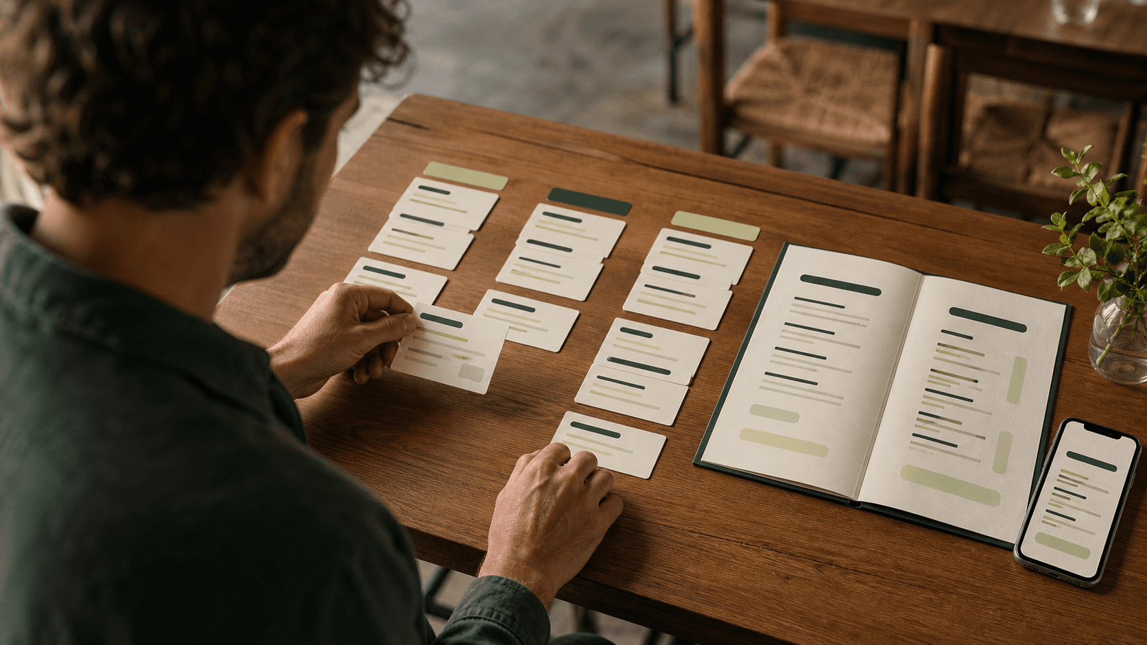
A well-organized restaurant menu answers three questions without making the guest work: What kind of food is available? Where can I find the item I want? How does this choice compare with the alternatives? The most useful structure is usually simple: familiar categories in a logical order, related items grouped together, and consistent names, descriptions, and prices.
How should a restaurant menu be organized?
Organize a restaurant menu by grouping items into familiar categories, arranging those categories in the order guests are likely to browse them, and placing related choices next to one another. A full-service dinner menu might move from small plates to mains, sides, desserts, and drinks. A cafe might begin with coffee, then tea, breakfast, sandwiches, and bakery items. There is no universal category order, but every order should match the restaurant’s main dining occasion rather than a designer’s preference.
The structure should also remain stable across formats. Guests should not have to relearn the menu when they move from a table card to a phone. A restaurant menu builder can keep that content connected while allowing each format to use the layout it needs.
Start with a complete menu inventory
Before moving items into a template, collect the current menu in a plain working list. Include every category, item name, description, price, size, and note that guests actually see. Add a source or reviewer for facts that need confirmation. This inventory exposes problems that a polished layout can hide: the same dish under two names, missing prices, inconsistent size labels, old seasonal items, and descriptions that no longer match the kitchen’s current preparation.
Work from the restaurant’s approved menu information, not from memory or a mix of old files. The goal is one reliable set of content that can produce several guest-facing views. The step-by-step restaurant menu guide covers the broader planning and publishing process; at this stage, concentrate on the information architecture rather than visual style.
Mark items that need a decision
Use a simple review status such as keep, revise, seasonal, or remove. Mark duplicate items, unclear names, missing descriptions, and choices that appear in more than one category. An item can appear twice when guests genuinely look for it in two places, but duplication should be intentional because it creates another location that must stay accurate. If two dishes differ only by a small ingredient or size, consider whether a clear option line would be easier to understand than two nearly identical entries.
Separate menu content from operational notes
Keep guest-facing information separate from internal prep instructions, recipe notes, or staff abbreviations. A menu item needs the details required to identify and choose it; it does not need the kitchen’s entire specification. This separation makes the menu easier to scan and reduces the risk that internal language reaches the public page. It also gives the owner a cleaner dataset to reuse in different restaurant menu templates.
Choose category names guests recognize
Category labels are navigation. Use the words a first-time guest is likely to understand, such as Breakfast, Small Plates, Noodles, Mains, Sides, Desserts, Beer, or Non-Alcoholic Drinks. A playful heading can support the restaurant’s voice, but it should not make the contents a puzzle. If a creative label needs a sentence of explanation, use a familiar label instead or pair the creative name with a clear descriptor.
Keep categories distinct. When an item could fit in several places, ask where a guest would look first. Put it there unless there is a strong reason to repeat it. Avoid a catch-all section that grows until it contains unrelated food; split it when a meaningful group has formed. At the same time, do not create a separate category for every two items. Too many short sections add navigation work, especially on a phone, and make the menu feel more fragmented than it is.
Use subcategories only when they shorten the search
Subcategories can make a large section easier to browse: a long drinks list might use Cocktails, Wine, Beer, and Alcohol-Free. A broad Asian restaurant menu might separate Rice, Noodles, and House Specialties. Add a subcategory when it gives several related items a useful home. Do not add one simply to decorate the page or create another heading level. The test is practical: does the label help a guest reach a likely choice faster?
Put categories in an order that matches the visit
The best category order reflects how the restaurant is used. For a full-service evening menu, the dining sequence is a sensible starting point: snacks or starters, mains, sides, desserts, then drinks if beverages are not presented separately. For a quick-service lunch menu, guests may care first about the main product families, followed by combinations, sides, and drinks. For a bakery, the main browsing order may be coffee, breakfast, breads, pastries, and celebration items. Start with the most common guest mission, then make exceptions for genuinely important categories.
On a phone, one category must come first and every later category sits farther down the page. Open a mobile menu example and notice how a clear category sequence works with navigation controls.
Keep the opening section useful
The first category should orient the guest, not merely occupy a prominent design position. A dinner restaurant might lead with Small Plates because they begin the meal; a coffee shop should probably not hide Espresso behind merchandise or a long brand story. Short introductory copy can explain a service format when necessary, but the guest should reach actual choices quickly. Restaurant history and sourcing details can support trust elsewhere on the page without interrupting menu navigation.
Arrange items within each category
Once the categories are stable, decide how items relate inside each section. Useful patterns include grouping by base ingredient, preparation, size, or style. A sandwich section might place vegetarian choices together; a noodle section might group broth-based dishes separately from stir-fried dishes; a wine list might move from lighter to fuller styles. Choose one organizing principle that guests can perceive, then apply it consistently. Random order makes comparison harder even when the category label is clear.
Give signature items a sensible position without turning the entire section into an advertisement. One restrained marker can identify a house specialty, but repeated badges, boxes, colors, and callouts compete with the menu’s basic hierarchy. If an item needs a label, define exactly what that label means and use it consistently. Do not fabricate popularity, awards, dietary status, or sourcing claims to make an item look important.
Keep comparable choices close together
Guests often decide by comparing neighboring items. Place comparable dishes together and describe them with parallel information. If one burger lists patty, cheese, sauce, and bun, nearby burgers should follow a similar pattern. If one coffee size is shown beside the name, use the same placement for the rest. The restaurant menu descriptions guide provides a repeatable way to write those item details once the order is settled.
Handle options without creating clutter
Sizes, proteins, and other menu choices should sit close to the item they change. Use a short, consistent line and make the price effect unambiguous. Do not scatter a relevant option into a distant notes section. When many items share the same choice, one clearly scoped note can be cleaner than repeating the sentence under every item, but it must be obvious which items the note covers. Review the result as a guest would; internal familiarity can make ambiguous formatting look clearer than it is.
Build a consistent information pattern
A guest should be able to learn the menu’s pattern from the first few items. Keep dish names, descriptions, prices, dietary markers, and size information in predictable positions. Use one capitalization style and one price format. Define a small set of dietary labels only when the restaurant can apply them accurately. Keep allergen communication careful and operationally supported; a graphic symbol should never promise a level of safety the restaurant cannot verify.
Consistency also improves maintenance. When every category follows the same information rules, missing details stand out during review and a new item has a clear format to follow. The readable menu design guide explains how typography and spacing reinforce this hierarchy. Organization supplies the underlying logic; visual design makes that logic visible.
Test the menu with realistic guest tasks
Ask someone who did not organize the menu to complete a few specific tasks: find a vegetarian main, compare two similar dishes, locate a non-alcoholic drink, identify the price of an add-on, and reach dessert on a phone. Watch where they pause or choose the wrong section. A direct observation is more useful than asking whether the menu looks good because it tests whether the structure supports real decisions.
Then proof the facts separately. Confirm category labels, item names, descriptions, prices, sizes, dietary markers, and availability. Scan for the same item in multiple places and make sure repeated information agrees. Check that every contextual note is close enough to the items it governs. Finally, view the page with JavaScript disabled or inspect the raw HTML so public menu content remains available to guests and search systems without browser-only loading.
Create a simple maintenance routine
Menu organization deteriorates when changes are made in several disconnected files. When a dish is added, decide its category, position, information pattern, and format impact. When a dish is removed, check every place it appears. Record the approval date for price and ingredient reviews so staff know which version is current.
Schedule a light audit before seasonal changes or reprints. Look for categories that have grown too large, sections with only one item, repeated dishes, inconsistent naming, outdated notes, and mobile navigation that no longer reflects the menu’s priorities. Good organization is not a one-time design exercise. It is a small operating habit that keeps the menu easier to understand as the restaurant changes.
Restaurant menu organization checklist
Before publishing, confirm that every current item appears once unless duplication is intentional; every category has a clear guest-facing name; categories follow the restaurant’s main dining occasion; related items sit together; names, descriptions, prices, sizes, and markers use a consistent pattern; and notes clearly identify the items they affect.
If the menu passes those checks, visual styling becomes much easier. The categories and item relationships already do the navigational work, so the template can focus on expressing the restaurant’s character without hiding the choices. That is the foundation of a menu that feels calm, useful, and ready to maintain.
After the review, compare mobile restaurant menu templates with the complete approved content, then open the live mobile menu example on a real phone. The strongest result is accurate, easy to navigate, and comfortable to read before it is published for guests.