
Menu photography
How to take mobile menu photos with a phone
Create clear, consistent dish images with simple light, honest styling, careful framing, and web-ready exports.
aiMenuu Editorial Team · August 2, 2026 · 9 min read
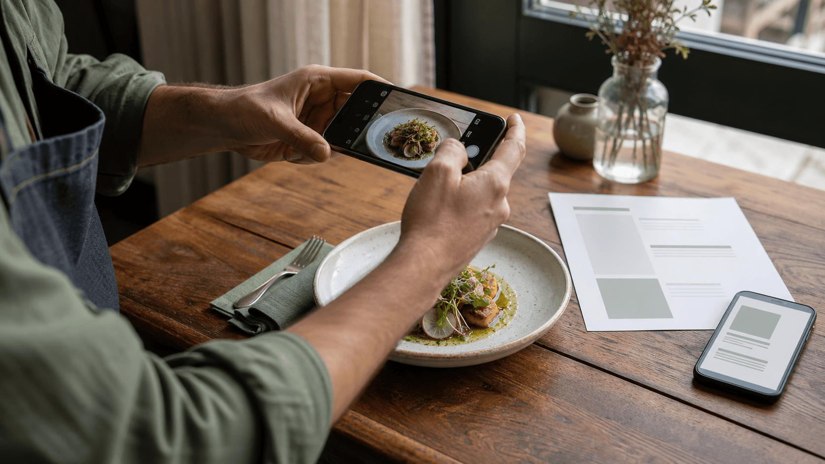
You can take useful restaurant menu photos with a recent smartphone, one dependable light source, and a repeatable setup. Place the dish near soft window light, turn off mixed overhead lighting, clean the scene, use the phone’s main camera without digital zoom, and make small exposure and color corrections after the shot. The goal is not to make the food look unreal. It is to show one dish clearly and consistently enough that a guest understands what to expect.
Can you take professional-looking menu photos with a phone?
Yes. A phone can produce clear, attractive menu photos when the light, food, background, and shooting process are controlled. The camera is only one part of the result. Soft directional light gives the dish shape, careful plating makes the ingredients understandable, a stable camera preserves detail, and consistent editing makes a group of images feel like one restaurant rather than a collection of unrelated snapshots. Those decisions usually matter more than adding a complicated camera setup.
Set an honest standard for the project. A professional food photographer may still be worthwhile for a major brand campaign, a difficult reflective subject, or a large library that must follow an exact art direction. For everyday menu maintenance, however, a repeatable phone setup gives an owner a practical way to keep images current without turning every change into a production.
Decide what the menu photo needs to do
Start with the destination. Open the actual layout and note the image shape, the smallest displayed size, and whether any edge will be cropped. If the same photograph must work in several places, leave a little space around the plate so each format can crop it without removing an important ingredient or cutting through the rim.
Choose which dishes genuinely need an image. Photography is most useful when a signature dish deserves emphasis, an unfamiliar item benefits from visual explanation, or a category becomes easier to browse with a few representative examples. A focused image list also gives you more time to make each selected dish accurate. Use the menu organization guide to settle categories and item order before deciding where photography will add clarity.
Make a simple shot list
For each selected dish, record the item name, final serving plate, required garnish, desired angle, destination, and person responsible for approval. Mark whether the image needs horizontal and vertical versions or whether one loose composition can cover both. Shoot the most time-sensitive items first: ice cream melts, fried food loses its crisp appearance, herbs wilt, and sauces spread. A short list keeps the session moving and reduces the chance that a dish reaches the camera incomplete.
Build a small phone photography setup
You do not need a studio full of equipment. Begin with a clean table near a window, the phone, a stable stand or small tripod, a white card or foam board to soften dark shadows, a neutral cloth, and a few cleaning supplies. A lint-free cloth for the camera lens is essential; fingerprints can lower contrast and create hazy highlights that are easy to mistake for a camera problem. Keep spare towels and cotton swabs nearby for cleaning plate rims and small spills.
Choose one background that fits the restaurant and does not compete with the food. Avoid strong patterns, reflective plastic, and unrelated props. A fork, napkin, or ingredient may provide scale and context, but every object should have a reason to be present. If the prop is more noticeable than the dish, remove it. Reusing the same surface and a restrained prop set is one of the easiest ways to create a coherent image library.
Create a repeatable position guide
Once a setup works, note where the table, plate, phone, and reflector sit. A few small pieces of removable tape outside the camera frame can mark the positions. Record the approximate distance from the phone to the dish and save a reference photo of the whole setup. This simple guide helps the next seasonal dish match images taken weeks earlier, even if a different staff member runs the session.
Use soft window light for natural color
Place the dish near a window where daylight reaches it from the side or slightly behind. Directional light reveals texture in a crust, sauce, or garnish; light coming straight from the phone can flatten those details. If direct sun creates hard, distracting shadows, move farther from the window or hang a thin white curtain to diffuse it. Put a white card opposite the window when the shadow side becomes too dark. Move the card closer for more fill and farther away for deeper contrast.
Turn off nearby ceiling lamps and heat lamps while you shoot. Daylight and warm indoor bulbs can create different colors on opposite sides of the same plate, making the food difficult to correct later. Watch the light over time as clouds move or the sun changes position. If a longer session produces visibly different exposures, pause and reset rather than trying to force every image to match afterward. Consistency begins on the table, not in an editing filter.
Prepare the real dish, not a fantasy version
Use the portion, plate, and key ingredients a guest will actually receive. Photography can present the dish at its best, but it should not promise a larger serving, an unavailable garnish, or a different preparation. Ask the person responsible for the recipe to approve the plate before shooting. Compare the image with the menu description guide so the visible ingredients and written details support each other instead of creating two versions of the item.
Clean the plate rim, wipe drips that look accidental, and turn the most recognizable ingredients toward the camera. Add sauce and delicate garnish close to shooting time. Separate elements that have collapsed into one indistinct mass, but do not rebuild the dish into a structure that cannot be served. Small, truthful adjustments improve legibility: showing the cut side of a sandwich, leaving space between two components, or placing a defining ingredient where it can be seen.
Work quickly without rushing
Set the background, light, phone, and empty plate position before the finished food arrives. Take a test shot with a substitute object to check the crop and exposure. When the real dish is ready, capture the planned angle first, review focus at full size, make one necessary correction, and shoot again. This is more reliable than taking dozens of nearly identical frames while the food loses its fresh appearance.
Choose an angle that explains the food
Use the angle that reveals the dish’s defining information. An overhead view works well for flat arrangements, shared plates, bowls with visible toppings, and geometric plating. A roughly 45-degree view feels natural for many plated mains because it shows both the top and the height. A lower side angle can explain a tall sandwich, layered dessert, or stack, but it may hide ingredients on the far side. Pick one main angle for each category and use exceptions only when the food needs them.
Keep the phone level where straight lines matter. Tilting a wide camera close to the plate can stretch the nearest edge and make the serving look distorted. Step back slightly and use the main camera rather than pinching in with digital zoom. Tap the most important part of the dish to focus, then lower the exposure a little if pale plates or glossy sauces are losing detail. Use a timer or a stable support when hand movement makes the image soft.
Leave room for menu crops
Take one safe frame with the complete plate and breathing room around it before trying a tighter composition. Keep critical details away from the extreme edges. Review the crop inside restaurant menu templates instead of assuming the camera frame will translate directly to the final design.
Keep the phone camera settings simple
Clean the lens, use the rear main camera, keep image resolution high, and avoid digital filters during capture. The standard lens generally gives a more natural result than an ultra-wide lens used close to the food. If the camera offers a grid, turn it on to keep the plate and table aligned. Portrait mode can be tempting, but artificial blur sometimes erases the edge of a glass, herb, fork, or plate. Use it only after checking the full-resolution result carefully.
Do not rely on the screen’s first impression. Zoom into the saved file and check the defining ingredient, garnish, and plate edge for sharpness. Look for clipped bright areas, a color cast, reflections of the phone, and accidental objects in the background. Capture a second frame after any change. A sharp, straightforward photograph gives you much more editing flexibility than an aggressively filtered or artificially blurred file.
Edit for accuracy and consistency
Begin with small global changes: straighten the image, correct the crop, adjust exposure, recover bright areas, open deep shadows slightly, and correct color so neutral plates and napkins look neutral. Compare the edited image with the real dish under normal dining-room light. Food should look appealing because the photograph is clear, not because saturation and contrast have pushed it into colors the kitchen cannot reproduce.
Apply a consistent editing recipe to the whole set, then adjust individual images only as needed. Similar warmth, contrast, crop, and background color help menu pages feel intentional. Avoid heavy preset filters, fake steam, duplicated ingredients, and edits that change portion size. Retouch temporary dust or a tiny plate smudge if necessary, but preserve permanent, recognizable qualities of the food. Keep the original file so future layouts can use a different crop without starting from a compressed copy.
Use a consistent file and naming system
Save a high-quality master with a descriptive name such as roasted-mushroom-gnocchi-master.jpg. Export a web version with a similarly clear filename and keep the item name or identifier in your working record. Avoid camera names such as IMG_4837 because they make later updates harder to trace.
Run a final photo quality check
Review each image against a short checklist: it shows the current dish and portion; the defining ingredients are visible; focus is sharp where it matters; color looks believable; highlights retain detail; the background is clean; props do not distract; and the crop works in its intended menu slot. Check the group as well. Plates should not jump unpredictably between tiny and oversized, backgrounds should feel related, and similar categories should follow a recognizable angle and editing style.
Ask one person who did not take the photos to compare the images with the item names and descriptions. Misidentification is an important warning: the angle may hide the feature that distinguishes two dishes, or the written description may need clarification. Then check every filename, alternative text, and menu placement before publishing.
A repeatable restaurant menu photo workflow
Use the same sequence for every session: choose the destination and crop, make the shot list, reset the saved table and light positions, clean the phone lens, prepare the real serving, capture a safe frame, inspect focus and exposure, make one correction, and take the final options. Select one approved frame while the dish is still available.
The strength of this workflow is not expensive equipment; it is repeatability. When a seasonal dish changes, the owner can recreate the light, framing, and finish instead of inventing a new visual style.
After the review, compare mobile restaurant menu templates with the complete approved content, then open the live mobile menu example on a real phone. The strongest result is accurate, easy to navigate, and comfortable to read before it is published for guests.