
Menu design
Restaurant menu redesign checklist: what to fix before you publish
Redesign a restaurant menu by auditing content, structure, branding, mobile readability, QR access, and launch checks before publishing.
aiMenuu Editorial Team · September 18, 2026 · 10 min read
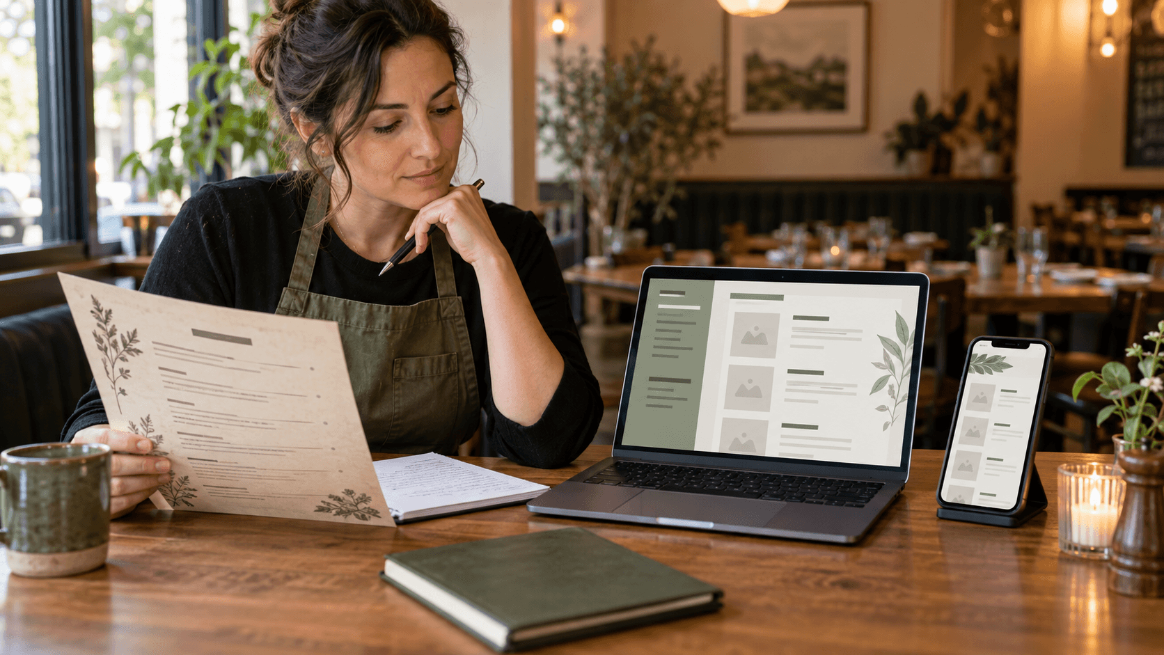
A restaurant menu redesign should make the current menu easier to understand, easier to maintain, and easier to use on a phone. Start with an owner-approved content audit, reorganize categories around real guest decisions, correct descriptions and prices, then apply a restrained visual system and test the public mobile page before publishing. Keep the redesign tied to one stable menu destination so existing links and QR materials continue to help guests instead of creating another outdated version.
Decide why the menu needs a redesign
A redesign is not a decoration project. Write down the problem it must solve in one sentence. The menu may be difficult to read on a phone, full of retired items, inconsistent with the restaurant’s current identity, expensive to update, or confusing because categories and prices no longer match how guests choose. That sentence becomes the standard for every later decision.
Separate evidence from taste. Repeated staff questions, guests pinching and zooming a PDF, incorrect prices, a high number of unavailable dishes, or a menu that cannot be updated without a designer are concrete problems. A preference for a new color is not useless, but it should not outrank accuracy, readability, or maintenance. Record the observed issue, who experiences it, and what a better result would allow them to do.
Set a narrow first release. An independent restaurant rarely needs to reinvent its entire brand, website, photography, signage, and menu at once. A practical project can update the content structure, mobile presentation, and public destination while preserving familiar visual elements. Smaller scope makes review more reliable and gives the owner a clear point at which the redesigned menu is ready to publish.
What should a restaurant menu redesign accomplish?
It should help a guest identify the restaurant, find a relevant category, understand dishes and prices, and move through the menu without unnecessary effort. It should also help the owner correct an item later without rebuilding the whole page. If a visual change does not improve one of those outcomes or support a deliberate brand choice, it may not belong in the first release.
Choose one owner-approved source of truth
Collect every active menu source before editing: the current printed copy, PDF, website page, social post, staff reference, and any handwritten changes. Mark which one is supposed to be current. Restaurants often discover that no single version is complete, so create a review sheet that lists every category, item, description, price, option, tag, and availability decision.
Resolve conflicts with the person authorized to approve the menu. Do not infer a price from a nearby row, copy a description from an old file without checking it, or keep a dish because it appears in the most attractive version. Mark uncertain entries openly and hold them from publication until they are confirmed. The redesign should remove ambiguity, not give it a more polished surface.
If the source is a PDF or set of photographs, use the aiMenuu mobile menu builder to create an editable structure instead of retyping every line. AI extraction can accelerate the first draft, but it does not replace owner review. Compare the result with the source page by page, correct category boundaries, and preserve approved edits rather than treating another extraction attempt as automatically more accurate.
Audit the menu before changing the layout
Review content in passes so visual decisions do not hide factual work. First remove items that are no longer sold and add missing current items. Next confirm names, ingredients, preparation details, portion notes, prices, and supported dietary labels. Then look for duplicated dishes, inconsistent capitalization, placeholder copy, unexplained abbreviations, and descriptions that promise something the restaurant does not serve.
Check operational reality without turning the menu into an operations system. Ask whether the kitchen consistently serves the listed version, whether the price includes the stated sides, and whether a tag such as vegetarian or gluten-free is accurate under the restaurant’s own preparation practices. The public menu should describe the offer honestly; stock control, ordering, and kitchen workflows remain separate responsibilities.
Give every item a simple disposition: keep, revise, add, retire, or confirm. That prevents quiet deletions and makes approval faster. Keep a dated copy of the approved source and the decision list. If a question appears after launch, the owner can see whether the published result reflects an intentional change or a transcription error.
Should a redesign shorten the menu?
Only when shorter content reflects the real offer. Remove duplication, retired dishes, and wording that does not help a guest choose, but do not delete legitimate items simply to fit a fashionable layout. A long menu can still work when categories are specific, navigation is clear, and repeated information is handled consistently.
Rebuild the category structure around guest decisions
Category order should follow the way a guest browses, not the sequence in which information happened to be entered. Use familiar, specific headings and group items that are meaningfully comparable. A vague category such as Favorites may be useful only when the restaurant truly maintains a small edited selection; otherwise guests may still need to search through the rest of the menu to understand what is available.
Keep categories large enough to feel useful and small enough to scan. One-item sections can interrupt the flow, while a section with dozens of unrelated dishes forces guests to read everything. The menu organization guide explains how to split, combine, and order sections without pretending every restaurant needs the same structure.
Test the first screen and the longest path. A guest should quickly recognize the restaurant and see how to reach major sections. On a long menu, category navigation should use concise labels and lead to actual headings in the page. Do not hide essential content behind an image carousel, a hover interaction, or a sign-in wall.
Rewrite names, descriptions, and prices for clarity
Use item names that staff and guests can identify consistently. Preserve culturally specific dish names when they are accurate, then add a concise explanation when the audience may need one. Avoid renaming a familiar dish merely to sound elaborate. The strongest name usually balances the restaurant’s voice with enough information to distinguish the item from its neighbors.
Descriptions should explain ingredients, preparation, accompaniments, or portion details that affect a decision. Remove generic praise that could describe anything. The menu description guide offers a practical pattern for useful detail without turning each item into an essay. Keep claims factual and do not invent origin, health, popularity, or sustainability statements that the restaurant cannot support.
Format prices predictably and keep each amount visibly connected to the correct item. Label sizes and portions instead of presenting unexplained columns of numbers. Separate included choices from paid additions, and make market-price wording easy to confirm. Long names and multiple prices are important stress cases for the redesigned mobile layout.
Refresh the visual identity without losing recognition
List the brand elements the restaurant already uses consistently: logo, name styling, colors, photography, illustration, and tone. Preserve the parts guests recognize unless there is a clear reason to change them. A menu redesign can feel current through better spacing, hierarchy, and image discipline without replacing every familiar signal.
Prepare logo files for real menu conditions. Use a clean, owner-controlled source with enough resolution, transparent edges when appropriate, and a compact version that remains recognizable on a small phone. If an existing mark needs cropping, color adjustment, or a cleaner export, an online logo editor can handle that separate brand-asset task. aiMenuu can place an uploaded restaurant logo in the menu, but it is not a logo-design service.
Choose one primary type style for headings and one highly readable style for menu details, or use a single flexible family. Limit the palette to colors that maintain sufficient contrast. Food photographs should be current, accurately represent the dish, and share a coherent crop and lighting approach. A few useful images are better than a crowded gallery of inconsistent shots.
Does every menu redesign need a new logo?
No. A legible existing logo can remain while the menu gains clearer hierarchy, better mobile behavior, and more consistent supporting colors. Replace the mark only when the restaurant has made a deliberate brand decision and owns the files needed for menus, social profiles, and other approved uses.
Choose a mobile-first menu layout
Evaluate layouts with the complete approved content, not a sample containing short dish names and perfect photos. Put the longest category, longest name, longest description, widest price, and most complicated option into each candidate. Choose a menu template only after those stress cases remain clear at a narrow phone width.
Use real text for the restaurant name, categories, dishes, descriptions, and prices. A flat image of a menu may look controlled on a designer’s screen but forces phone users to zoom, makes text less accessible, and makes small corrections expensive. A responsive page can adapt spacing and line breaks while keeping the underlying content selectable and indexable.
Keep interaction modest. Clear vertical reading, visible category navigation, comfortable tap targets, and predictable item blocks matter more than animation. Test with enlarged browser text and a slow connection. The page should not create horizontal scrolling, detach prices from items, shift dramatically as images load, or require JavaScript before primary menu content appears.
Plan the QR code menu destination before printing
A QR code menu should open the canonical public menu page directly. Do not point new materials to an editor, preview session, temporary file, or image download. The destination should use HTTPS, load without an account, identify the restaurant immediately, and show the current menu in readable page text.
Keep the destination stable through later price, description, image, and style changes. When the content can be updated behind one maintained address, the restaurant does not need to replace every table card after a routine edit. If the public slug or domain must change, plan a durable redirect before producing new materials and keep only one canonical address in circulation.
Follow the practical QR code menu guide for size, quiet space, contrast, placement, and device testing. Print a small proof first, place it where guests will actually scan, and try several phones under restaurant lighting. Add a plain-language label and a short readable address so the code is not the only explanation or access path.
Should the QR code change when the menu is redesigned?
Not when the existing code already points to a stable menu URL the restaurant controls. Update and republish the page, then scan an existing code to confirm it reaches the redesign. Replace the code only when the destination itself must change or the original print is damaged, too small, low contrast, or otherwise unreliable.
Build accessibility into the redesign
Use semantic headings, genuine text, sufficient color contrast, descriptive links, meaningful alternative text, and a logical reading order. Do not rely on color alone for dietary tags or availability. Decorative images can have empty alternative text, while informative food or restaurant images should describe what matters without repeating nearby copy.
Test keyboard navigation and enlarged text. Category links should reach their sections, focus should remain visible, and no important content should disappear when text grows. On a phone, buttons and links need enough space to activate without hitting a neighbor. Motion should be unnecessary for understanding the menu.
Keep a no-phone alternative available. Some guests cannot scan comfortably, do not have a compatible device, have limited connectivity, or prefer a physical copy. A readable current printed menu or staff-supported alternative should be available without making the guest justify the request.
Proof the redesign as a guest
Run separate reviews for facts and presentation. During the factual pass, compare every published category, item, description, price, option, and tag with the approved source. During the visual pass, look for unclear hierarchy, awkward wrapping, inconsistent images, weak contrast, excessive scrolling, and prices that appear attached to the wrong item.
Use the restaurant menu proofreading checklist and involve at least one person who did not build the page. Ask them to find a real dish, compare two prices, locate a category, identify an option, and return to the top. A task reveals more than a general question about whether the design looks good.
Open the public link while signed out and test the same path guests will use: restaurant website or social profile, QR scan, public menu, category navigation, and final item. Try Wi-Fi and mobile data, a narrow phone, a larger screen, and enlarged text. Confirm that the restaurant name, canonical address, page title, description, and social preview all identify the correct business and menu.
Publish in a controlled handoff
Choose a launch owner and a specific approval time. Freeze content briefly while the final proof is underway so two people do not edit different versions. Record the approved source, confirm the public URL, publish the redesign, and recheck the live page rather than assuming the preview and production result are identical.
Replace or retire active materials that show obsolete content. Update the restaurant website and social profile when they point to an old file, but avoid changing a stable menu address without need. Scan existing table codes after publication. Tell staff what changed and where to report a mismatch, then keep the previous approved version long enough to diagnose an unexpected issue.
Do not measure success as page views alone. Track whether owners complete the import and publication workflow, whether guests can reach and browse the menu, and whether reported errors decline. Conversion or revenue effects require approved analytics evidence and a suitable comparison; do not infer them from a polished design or a temporary traffic increase.
Use this restaurant menu redesign checklist
Before design, define the problem, owner, scope, audience, approved source, and launch date. During content review, confirm every category, item, description, price, option, tag, and image right. During visual review, test identity, hierarchy, contrast, spacing, photo consistency, long content, narrow screens, enlarged text, keyboard access, and the no-phone alternative.
Before publication, verify the public HTTPS address, canonical page, restaurant identity, metadata, social image, indexable text, QR destination, redirects, and signed-out access. Proof the exact printed code at its intended size and location. After publication, scan an existing code, inspect the live mobile page, update old links, brief staff, and assign a recurring accuracy review.
To move from an outdated menu to a structured draft, import your current menu, review the extracted content, choose a layout, and publish a mobile version at a stable address. The live mobile menu example shows the guest-facing result. Keep the redesign focused on accurate browsing and easy updates; ordering, payments, delivery, and kitchen systems remain outside the menu-building task.