
Menu pricing
How to display prices on a restaurant menu
Format restaurant menu prices clearly, consistently, and responsively so guests can compare dishes without confusion.
aiMenuu Editorial Team · August 21, 2026 · 10 min read
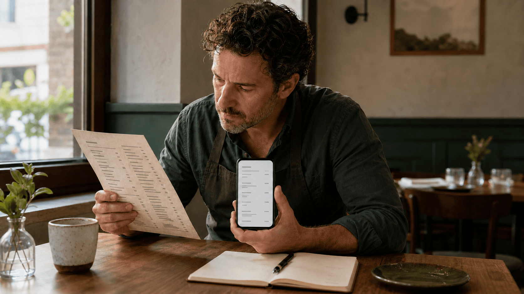
Display restaurant menu prices in one predictable format, keep each price visibly connected to the correct dish, and test the final layout on a narrow phone. Clear price presentation is not about hiding cost or using tricks. It is about helping guests understand what an item costs, what changes the amount, and which choice the price belongs to.
Start with one approved price source
Before adjusting typography or alignment, decide which document or system contains the owner-approved prices. A restaurant often has several copies of the same information: a photographed menu, an old PDF, a staff reference, a website page, and a draft on someone’s laptop. If those copies disagree, a beautiful layout will only publish the disagreement more clearly.
Create one review list with every category, item, size, option, add-on, and current amount. Mark uncertain entries instead of guessing. Ask the person authorized to approve prices to resolve them before publication, then record the approval date. This source becomes the reference for the mobile menu and for later checks.
If the current menu exists as an image or PDF, the aiMenuu mobile menu builder can turn it into an editable draft. Extraction saves retyping time, but the owner still needs to compare every amount with the source. Pay special attention to faint decimals, columns that have shifted, handwritten changes, and prices printed far from their item names.
Treat missing prices as unresolved information
A blank or unreadable price should enter a review queue, not become zero, disappear silently, or inherit the amount from a nearby item. Keep the item unpublished until the correct amount is confirmed. This is especially important when a source uses several columns, because a visually adjacent number may belong to another size or dish.
Choose a consistent price format
Consistency helps a guest recognize prices without relearning the pattern in every category. Decide whether the menu shows a currency symbol, whether whole-dollar prices include trailing zeros, how ranges are written, and how multiple sizes are labeled. Apply the convention to food, drinks, specials, and add-ons alike.
For a US menu, $12, $12.00, and 12 can each be understandable in the right context. The confusing choice is to mix all three without a reason. If some prices require cents, using two decimal places throughout often creates the steadiest visual rhythm. If every amount is a whole dollar and the currency is obvious, a shorter format may be easier to scan. Keep the underlying stored amount exact even when the display omits unnecessary zeros.
Do not shrink, fade, or disguise prices to make them less noticeable. Guests should be able to compare items without hunting. A restrained price style can support the item name rather than dominate it, but sufficient contrast and size remain essential.
Should restaurant menu prices include a dollar sign?
They can. A dollar sign is useful when the currency could be unclear, the menu may be shared outside the restaurant, or guests may come from different regions. Omitting it can also work when the menu clearly establishes one currency and every amount follows the same pattern. Choose based on clarity and context, not on a claim that one symbol will automatically change spending behavior.
Should prices include .00?
Use .00 when it matches the rest of the amounts or prevents ambiguity. Omit it when every listed amount is a whole number and the shorter form improves scanning. Avoid mixing 12, 12.0, and 12.00. If an item is 12.50, the surrounding menu usually looks more deliberate when other prices also use two decimal places.
Keep the price attached to the correct item
A guest should never have to trace an amount across a wide gap or guess which wrapped line it belongs to. On a phone, long dish names and descriptions can change the height of every row. The price must move with its item rather than depending on a desktop-style column that loses alignment as text wraps.
Place the amount on the same line as the name when space allows. If a long name wraps, keep the price in the same item block—either aligned with the first line or placed clearly beneath the name. Use spacing, dividers, or repeated card structure so the boundary between one dish and the next remains obvious.
Open the live mobile menu example on a narrow screen and scan several categories without reading every word. You should be able to tell immediately which price belongs to which dish. That quick association is a better test than whether all amounts form a perfectly straight column in a desktop mockup.
Label sizes and portions before listing amounts
Multiple prices need labels. A row such as 9 / 13 / 17 forces the guest to search for a key and creates an easy opportunity for misunderstanding. Write the size or portion beside each amount: Cup $6 · Bowl $9, 10-inch $14 · 14-inch $20, or Glass $11 · Bottle $42. Use the terms guests and staff already use.
Keep label order consistent. If coffee sizes run Small, Medium, Large, do not reverse the order in another drink category. If a pizza menu lists dimensions, use the same unit and punctuation throughout. When portions differ in a way a size word cannot explain, add a concise description such as serves two or six pieces.
Do not create a variant merely to make the layout symmetrical. If only one item has a family portion, label that item directly. Clear exceptions are easier to understand than a menu-wide system filled with blanks. Organize a mobile restaurant menu around genuine guest choices, then let the visual layout reflect that structure.
Separate included choices from paid add-ons
A menu should distinguish between a choice that is included in the displayed price and one that adds to it. If a sandwich includes a choice of side, say so near the sandwich. If fries cost an additional $2, place +$2 beside that option rather than leaving the guest to discover the difference elsewhere.
Group related extras under the relevant category or item. Use plain labels such as Add avocado +$3 or Substitute side salad +$2. Avoid a detached page of surcharges unless those amounts genuinely apply across the menu and the relationship is unmistakable. Repeating a small amount can be more useful than making the guest search for it.
Keep extra-price language concise, but do not remove information needed to understand the choice. Write clearer dish descriptions so ingredients and preparation stay separate from price rules. The item name and description explain what the dish is; the option line explains how the amount changes.
Use market price only for genuinely variable items
Market price is appropriate when the restaurant cannot reasonably publish one stable amount because the ingredient cost or portion changes frequently. It should not become a substitute for maintaining the menu. If the amount is predictable for the current service period, publishing the current price is usually clearer for guests.
When market price is necessary, write the term in full or use a clearly defined abbreviation, and make sure staff can provide the current amount consistently. Review the item whenever the source cost, portion, or availability changes. A guest should not receive different answers depending on whom they ask.
Consider whether a narrow range, dated special, or regularly updated fixed amount would communicate better. The right choice depends on how often the amount truly changes and whether the restaurant can maintain the public menu. Do not publish an invented estimate simply to fill the field.
Design price hierarchy for a phone screen
Price presentation is part of the complete item hierarchy. The guest normally needs the dish name first, a useful description when needed, and the amount at the same moment. Category headings, item names, descriptions, prices, and option labels should each have a distinct but related style.
Use a type size that remains comfortable on a small phone, adequate contrast against the background, and enough line spacing for wrapped content. Do not encode the only relationship with color. A price that turns green for one size and gray for another may be unclear to guests who see colors differently or use a dim screen.
After the content is approved, place it in a menu template and test the longest dish name, the item with the most options, the widest price, and the category with the densest rows. Enlarge browser text and look for overlap, clipped amounts, detached labels, or horizontal scrolling. The layout must adapt to content rather than requiring the owner to shorten accurate information.
Should menu prices be right-aligned?
Right alignment can make a compact list easy to compare when every row is short and the association remains obvious. It is not a requirement. On narrow screens or image-led cards, placing the amount directly below or beside the name may be clearer. Judge the relationship at mobile width, not by whether the numbers create a neat vertical edge on a large monitor.
Avoid pricing patterns that create doubt
Several small inconsistencies can make an otherwise accurate menu feel unreliable. Watch for one category using currency symbols while another omits them, a size key that changes order, a description containing an old amount, or an image that still shows a retired price. Remove placeholder values such as 0.00 and draft notes before publishing.
Do not use a price range when the guest must choose one defined option. A range such as $12–$18 is helpful only if the menu explains what produces each amount. Otherwise list the named sizes or versions separately. Likewise, starting at is useful only when a clear base configuration exists and every common addition is disclosed beside its extra amount.
Avoid presenting promotional comparisons that are not current and verifiable. If a limited-time amount ends, remove the message promptly. The menu update schedule can help assign monthly accuracy checks and a defined process for seasonal changes so temporary prices do not linger.
Coordinate each approved price change
A price change is complete only when every guest-facing reference that is still in use agrees. Update the approved source, the published mobile menu, current promotional materials, and any staff reference that names the amount. Retire screenshots, old files, or table inserts that could keep circulating after the change.
A permanent restaurant QR code helps because the printed code can continue opening the same live destination while the owner updates menu content behind it. Do not generate a new code for every amount change. Instead, preserve the destination, publish the revised menu, and scan an existing table code to confirm that it reaches the new version.
Record the change date, approver, affected items, and old and new amounts. A short change log makes later troubleshooting much easier. If a guest or staff member reports a mismatch, the restaurant can identify whether an old material remains in use or the digital update failed to publish.
Proofread prices in the rendered menu
Do not approve prices only in an editor form or spreadsheet. Review the same mobile page guests will see. Read from top to bottom once for exact amounts, then scan again for visual association, consistent formatting, and complete labels. A restaurant menu proofreading checklist helps separate factual review from layout review so neither is rushed.
Use two people when possible. The first compares the rendered menu with the approved source and reads each item and amount aloud. The second confirms the match and checks sizes, add-ons, and decimal placement. Reverse roles for a second category if the menu is long; fresh attention catches more than repeated solo reading.
Test at a narrow phone width and on at least one real device. Scan the restaurant’s actual QR code, verify the restaurant identity and canonical URL, open every category, and inspect the first and last item in each section. Confirm that a long description cannot push its price into the next row and that enlarged text does not hide any amount.
Use a final restaurant menu price checklist
Before publishing, confirm that every item has the owner-approved amount or an intentional, clearly stated market-price label. Check that one currency and decimal convention is used throughout; every size and portion has a label; included choices and paid extras are separated; ranges and starting prices explain what changes the amount; and no old price survives in a description or image.
Then check presentation. Each price should remain visually attached to its item at mobile width, text should have sufficient size and contrast, and long names should wrap without overlap. Compare the finished structure with guidance on how long a mobile restaurant menu should be if dense categories make accurate prices difficult to scan.
Finally, publish the approved version, scan an existing QR code, and save the change record. Recheck the live page after any later template, description, or category edit. Price clarity is not a one-time styling decision; it is a small operating discipline that keeps the public menu trustworthy.
Make price updates easier to maintain
The simplest system keeps structured item names, descriptions, and amounts in one editable menu rather than flattening them into a static picture. That allows the owner to correct one field, preview the result, and publish the revised mobile menu without rebuilding the entire page or changing the permanent QR destination.
Use the same naming and formatting rules whenever a new item is added. If the restaurant expands from single prices to several sizes, update the data structure and label pattern before adding more variations. A small amount of consistency at entry time prevents a large cleanup before the next publication.
Clear restaurant menu pricing respects the guest and protects the restaurant from avoidable confusion. Start with an approved source, use one predictable format, explain every variation, and test the final page on the device where guests will read it.