
Mobile menu design
How to choose a mobile restaurant menu template
Choose a mobile restaurant menu template that fits your real content, brand, photos, categories, and guests' phones.
aiMenuu Editorial Team · August 12, 2026 · 10 min read
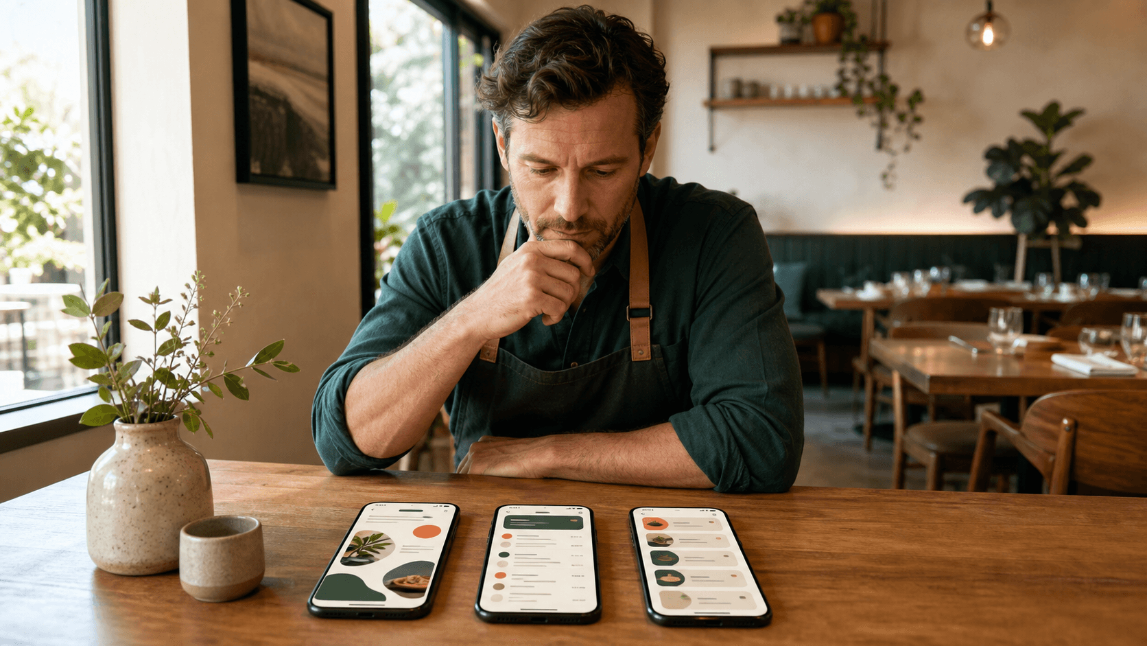
Choose a mobile restaurant menu template by testing your complete menu inside it, not by judging an attractive sample screen. The best template makes real category names, dishes, descriptions, prices, and photos easy to browse on an ordinary phone while still feeling like your restaurant.
Start with the menu you really have
Template previews are usually built with tidy dish names, balanced categories, short descriptions, and carefully cropped photographs. Your menu may have a twelve-word house specialty, three prices for one item, a category with two dishes, another with twenty, and several descriptions that wrap onto a third line. Those differences determine whether a design still works after the sample content disappears.
Prepare the current owner-approved menu before comparing styles. Include every category, item name, description, price, supported dietary note, option line, and photograph you intend to publish. If the source is a PDF or image, use the aiMenuu mobile menu builder to create a structured draft, then review the extraction before using it to judge templates. A design decision is only useful when it is based on accurate content.
Create a small stress-test set as well: the longest category name, longest dish name, longest description, item with the most prices, and largest category. Put those cases into every finalist first. If they become cramped, clipped, or ambiguous, the template will not improve when the rest of the menu is added.
Define what the template must help guests do
A mobile restaurant menu has one primary job: help a guest find, understand, and compare what the restaurant serves. Write down the most common browsing tasks before choosing a visual style. A guest may need to jump to drinks, compare two noodle dishes, find a vegetarian option, understand an unfamiliar ingredient, or check a price without pinching and zooming.
Turn those tasks into requirements. If the menu is long, persistent category navigation matters more than a dramatic opening image. If many dishes are unfamiliar, descriptions and photographs may need more room. If the restaurant offers a short tasting selection, a quieter type-led layout may give each course suitable emphasis. Choosing for the browsing task keeps personal design taste from becoming the only criterion.
Try the live mobile menu example on your own phone and notice how quickly you can identify the restaurant, move between categories, and connect each price to the correct dish. Use that same task-based test on every template you shortlist.
Match the layout to your content density
Content density is the combination of category count, item count, description length, price complexity, and image use. A template with generous cards can feel calm with twenty dishes and exhausting with one hundred. A compact list can make a large menu efficient but may understate a small, premium selection. Neither approach is universally better; the fit depends on the real menu.
Estimate how much information a guest sees before scrolling. The first screen should establish the restaurant and give a useful route into the menu, but it does not need to display every category. More important is a steady rhythm in which names, descriptions, prices, and images repeat predictably. Consistency reduces the effort required to compare items farther down the page.
For short menus
A short menu can support larger headings, more breathing room, and selective photography. Avoid stretching a small selection into oversized sections merely to make the page feel substantial. Let concise categories and confident spacing communicate focus. A typography-led or editorial template often suits a restaurant whose menu is intentionally narrow.
For long menus
A long menu needs efficient item spacing, familiar category labels, and a quick way to move between sections. Compact does not mean tiny. Keep dish names and prices readable, shorten repetitive descriptions, and reserve imagery for items where it genuinely helps recognition. The guide to how long a mobile restaurant menu should be explains how category structure can make a substantial menu feel manageable without hiding legitimate dishes.
Choose between image-led and type-led styles
An image-led template works when the restaurant has a consistent set of honest, well-lit dish photographs and when seeing the food helps guests understand it. It is a poor fit when only a few items have usable images, crops vary wildly, or the photographs make the page slow. Empty photo frames and repeated pictures are more distracting than a deliberate text-only menu.
A type-led template puts greater weight on names, descriptions, hierarchy, and spacing. It can feel especially appropriate for frequently changing menus, familiar dishes, or restaurants that do not yet have a complete photo library. Type-led does not mean plain: color, dividers, category treatments, and a strong restaurant identity can create character without a photograph beside every item.
If you choose imagery, decide what a photo must accomplish. It might introduce an unfamiliar dish, highlight a signature item, or set the tone at the top of a category. Follow one crop ratio and one lighting approach. The mobile menu photography guide can help you build a consistent set with a phone instead of mixing unrelated images simply to fill the layout.
Organize categories before evaluating decoration
A beautiful theme cannot rescue confusing information architecture. Category names should use the words guests expect, and related dishes should stay together. Before comparing colors or header styles, organize a mobile restaurant menu around a clear browsing path. Then verify that the template can display those categories without truncation or an overcrowded navigation bar.
Pay attention to category depth. Most restaurant menus need one practical level of navigation rather than a maze of nested sections. If a category contains only one item, ask whether that item belongs in a related section. If one category dominates the page, consider whether a genuine guest-facing distinction can divide it. The structure should clarify the restaurant's offering, not merely produce a symmetrical design.
Test category order with likely guest intent. Main food sections usually deserve earlier placement, while drinks, sides, and desserts must remain easy to reach. A template should let you change that order without breaking its visual balance, because menu structure will evolve even when the restaurant keeps the same overall style.
Protect readability with typography
Mobile typography must survive more than a large desktop preview. Dish names, descriptions, prices, category controls, and supporting notes should remain distinct on a narrow screen. Look for a clear size and weight difference between category headings, item names, and descriptions. Avoid templates that depend on very thin type, tightly packed lines, or long passages of centered text.
A decorative display face can give category headings personality, but simpler type usually works better for descriptions and prices. Check common characters, currency symbols, accented words, and any languages the restaurant uses. A typeface that looks elegant in a short English sample may become hard to scan with longer names or a second writing system.
Increase browser text size during the preview. Content should wrap naturally rather than overlap, disappear, or force sideways scrolling. A template that adapts to enlarged text is more robust for guests with different vision needs and for phones with accessibility settings enabled.
Use color for hierarchy, not camouflage
Restaurant colors can make a mobile menu recognizable, but every brand color does not need equal space. Choose a dependable background, a high-contrast text color, and one or two accent roles for category states, dividers, or small highlights. The dish information should remain the strongest signal on the page.
Preview the palette in bright daylight and in a dim dining room. Muted text that looks refined on a calibrated monitor can become difficult to read on a phone with reduced brightness. Likewise, a saturated background may overpower photographs or make long descriptions tiring. If the template offers light and dark variations, judge each with real content instead of assuming the darker option is automatically more premium.
Do not place essential labels only in color. Active categories, availability notes, or supported dietary information should also use words, icons with labels, weight, or another visible cue. This keeps the menu understandable when colors appear differently across screens.
Match the restaurant's character without copying the room
The template should feel compatible with the restaurant, not like a literal digital replica of its wallpaper, tableware, and signs. Identify three brand qualities such as warm, energetic, precise, playful, traditional, or seasonal. Compare each template against those qualities while keeping readability as the non-negotiable foundation.
A neighborhood cafe may benefit from an approachable cafe mobile menu template with friendly spacing and prominent morning categories. A fine-dining restaurant may prefer restrained typography and fewer visual accents. A busy counter-service concept may need quicker category movement and denser item rows. Cuisine can inform photography and tone, but it should not force the restaurant into a visual stereotype.
Keep branding consistent across the guest journey
Use the correct restaurant name, logo treatment, colors, and writing voice so the QR destination feels intentional. The table card and mobile page do not need identical layouts, but they should clearly belong to the same restaurant. Consistency reassures a guest that the scanned page is current and official.
Check how the template handles prices and options
Prices must stay visibly connected to the correct dish. Test a basic single price, multiple sizes, a market-price label if the restaurant genuinely uses one, and any concise option line the menu needs. Narrow screens may push a right-aligned price under the name, so the relationship must remain clear even after wrapping.
Use one consistent price format throughout the menu. Avoid a template that makes prices so faint that guests have to hunt for them, or so dominant that the page becomes a price list without dish context. The visual priority should support comparison: item name first, useful description next, and price easy to locate at the same moment.
Long descriptions also deserve a realistic test. If current copy is repetitive or vague, write mobile menu descriptions that identify meaningful ingredients, preparation, portion, or character in fewer words. Better content often improves a template more than shrinking the font or removing spacing.
Test the template on real phones
Preview at more than one desktop browser width, then open the actual page on a smaller iPhone and an Android phone when possible. Scroll every category, tap every navigation control, rotate the phone, and enlarge browser text. Check for clipped names, detached prices, awkward image crops, unexpected horizontal movement, and controls that are difficult to tap.
Ask someone who did not build the menu to complete three tasks: find a named category, compare two similar dishes, and locate a specific price. Watch where they pause. A template can look orderly to its editor because the editor already knows the structure; a fresh reader exposes whether the hierarchy actually communicates.
Test the public path as well. Scan the table QR code from a realistic distance and confirm that it opens the canonical mobile menu directly over HTTPS. The page should identify the restaurant immediately and provide useful menu content without requiring an app, account, or extra navigation step.
Consider speed and image behavior
A visually rich template should still load comfortably on a cellular connection. Large hero images and full photo galleries can delay the information a guest needs at the table. Prefer layouts that reserve image dimensions, use appropriately sized files, and display the restaurant name and first useful category without waiting for decorative media.
Every meaningful dish photograph needs descriptive alternative text, while decorative texture can use empty alternative text. Names, descriptions, prices, and category labels should remain real page text rather than being flattened into graphics. That supports assistive technology, browser text enlargement, translation tools, and search discovery while making future updates easier.
When comparing two equally readable styles, choose the lighter one. Faster pages feel more dependable, particularly when many guests share a weak connection. Performance is not a separate technical concern; it is part of whether the template works in the restaurant's real environment.
Use a simple template scorecard
Choose two or three finalists from the mobile restaurant menu template library and score each from one to five against the same criteria: category navigation, item readability, price clarity, long-content handling, photo fit, brand fit, phone responsiveness, enlarged-text behavior, and loading speed. Give readability and navigation more weight than decorative preference.
Add one sentence of evidence beside every score. For example: 'All nine categories fit the navigation without truncation,' or 'Three long dish names push prices onto confusing lines.' Evidence makes the decision easier to explain to a co-owner and prevents a strong first impression from hiding practical problems.
Know the warning signs
Reject a template if it requires you to delete useful descriptions, use the same photo repeatedly, shorten accurate category names, hide prices, or reduce type until it becomes uncomfortable. Also reject it if the menu only looks balanced with sample content. The restaurant's information should shape the design; the design should not distort the information.
Break close ties with a guest test
If two templates score similarly, give both to a few people who resemble your guests. Ask them to complete the same tasks without coaching, then ask which version felt easier and why. A small structured test is more useful than a broad vote based on screenshots because it evaluates the menu's actual job.
Publish one strong choice and refine it
Once a template passes the content, brand, device, and speed checks, commit to it long enough to learn from real use. Constant theme switching creates inconsistency and makes it harder to know whether a change helped. Improve category names, descriptions, photographs, and item order inside the chosen system before assuming the entire design must change.
Before launch, proofread a mobile restaurant menu in its final rendered form. Confirm every fact, scan the permanent QR code, open the canonical URL, inspect metadata and the social image, and ask a second person to check the live page. Keep a dated record of who approved the content.
The right template is not the most elaborate option in the gallery. It is the one that makes your complete, accurate menu feel unmistakably yours and remarkably easy to use on a phone. Start with real content, compare finalists against the same requirements, and let guest clarity decide.